Happy Global Accessibility Awareness Day!
Accessibility has become a hot topic in the digital world: when designing and developing online platforms, how can we ensure that our content is accessible to everyone? Building an online educational product, considering accessibility when developing content is all the more important to improve user engagement and facilitate the learning experience.
If you are a regular Kognity user, you might have noticed a few changes in the style of our illustrations in the last few months: digital accessibility has been ranked as the second key issue in teaching and learning in 2018 by Educause (a learning initiative) and we are committed to improving our standards and to taking steps toward becoming a fully accessible platform.
Why is this important?
With one billion people in the world experiencing some form of disability, we are aware that making those improvements will ensure equal access to our content for all users while being beneficial to all by providing an enhanced user experience with clearer and more readable visuals.
So what have we done?
We have been working together with an accessibility expert to improve the quality and standards of our visuals and implemented some changes in the following areas:
- We have updated our font to Source Sans pro, which is a sans serif font that was developed to work well in user interfaces and has good readability levels
- We have updated our colour palette and implemented a set of guidelines to ensure that there is always sufficient contrast between foreground and background colours and between different combinations of colours
- We have also developed some guidelines to ensure that we avoid some combinations of colours that can be problematic for some users (due to vibration or colour-vision impairments), as well as guidelines that aim to improve the readability of our maps

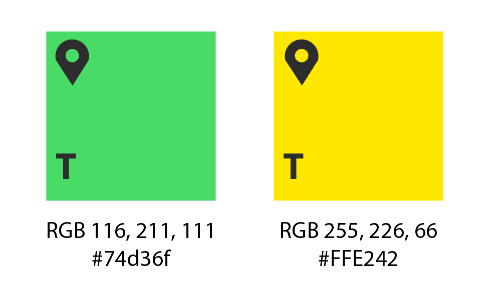
Two colours from our updated colour palette to ensure sufficient contrast between foreground and background content
There are many areas that we will keep exploring in terms of accessibility, however we are aware that becoming an accessible product is something that is done one step at a time. We are very excited to have launched our first set of content design accessibility guidelines and are looking forward to implementing further changes in the near future. But we all know that an image is worth a thousand words, so let’s let some examples speak for us!
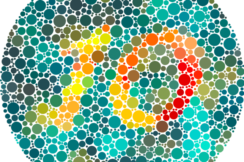
If you would like to check your level of colour blindness, here’s a test that you can take in 2 minutes! https://enchroma.com/pages/test
You can find more information on Global Accessibility Awareness day here:
https://globalaccessibilityawarenessday.org/
Do you have any thoughts on accessibility? We are discussing it today over on our new Kommunity, come and join the conversation!


